Photographer's portfolio
Dorothy DeLong
Dorothy DeLong
Dorothy DeLong
COMPANY
COMPANY
Dorothy DeLong
Dorothy DeLong
Dorothy DeLong
ROLE
ROLE
UX Designer
UX Designer
UX Designer
YEAR
YEAR
2025
2025
2025

Expanding Visibility & Reach
Expanding Visibility & Reach
Expanding Visibility & Reach
Dorothy DeLong, a feminist photographer, approached me to develop a website for her portfolio. Her goal was to showcase her work while ensuring that magazines and museums could easily get in touch for feature opportunities.
Dorothy DeLong, a feminist photographer, approached me to develop a website for her portfolio. Her goal was to showcase her work while ensuring that magazines and museums could easily get in touch for feature opportunities.
Dorothy DeLong, a feminist photographer, approached me to develop a website for her portfolio. Her goal was to showcase her work while ensuring that magazines and museums could easily get in touch for feature opportunities.
Project Overview
Project Overview
Project Overview
Dorothy needed my help to translate her work into a sleek, professional website that effectively represents her feminist vision, artistry and facilitates contact.
Dorothy needed my help to translate her work into a sleek, professional website that effectively represents her feminist vision, artistry and facilitates contact.
Dorothy needed my help to translate her work into a sleek, professional website that effectively represents her feminist vision, artistry and facilitates contact.
Design Process
Design Process
Design Process
My responsibilities
My responsibilities
My responsibilities
This project consisted of creating a single-page, scrollable web design. As the only designer on the project, I collaborated closely with Dorothy to:
• Analyze Dorothy’s competitors
• Research opportunities where Dorothy’s business can stand out
• Create wireframes for the site
• Create prototypes to illustrate suggested site updates
• Choose a color scheme and type scale for Dorothy
• Create a polished design comp for handoff to a developer
This project consisted of creating a single-page, scrollable web design. As the only designer on the project, I collaborated closely with Dorothy to:
Analyze Dorothy’s competitors.
Research opportunities where
Dorothy’s business can stand out.
Create wireframes for the site.
Create prototypes to illustrate suggested site updates.
Choose a color scheme and type scale for Dorothy.
Create a polished design comp for handoff to a developer.
The need for a more polished presence
The need for a more polished presence
The need for a more polished presence
Dorothy DeLong travels nationwide, capturing powerful images of women engaged in extraordinary work. While she initially shared her photography on Facebook, the growing recognition of her work created the need for a more professional platform—one she could confidently present to museums and magazines. A sophisticated website would also entice magazines to purchase her photos for publication. Up until now, she hasn’t had a good place to showcase her work when magazines ask for a portfolio.
Dorothy DeLong travels nationwide, capturing powerful images of women engaged in extraordinary work. While she initially shared her photography on Facebook, the growing recognition of her work created the need for a more professional platform—one she could confidently present to museums and magazines. A sophisticated website would also entice magazines to purchase her photos for publication. Up until now, she hasn’t had a good place to showcase her work when magazines ask for a portfolio.
Dorothy DeLong travels nationwide, capturing powerful images of women engaged in extraordinary work. While she initially shared her photography on Facebook, the growing recognition of her work created the need for a more professional platform—one she could confidently present to museums and magazines. A sophisticated website would also entice magazines to purchase her photos for publication. Up until now, she hasn’t had a good place to showcase her work when magazines ask for a portfolio.
This site will include:
This site will include:
This site will include:
• A versatile gallery showcasing Dorothy’s photographs
• Her artist’s statement
• Bio and headshot of Dorothy
• A quote about her mission
• Site navigation that will link to each content section
• Her logo and full name
• Contact information
• Social media links
• A versatile gallery showcasing Dorothy’s photographs
• Her artist’s statement
• Bio and headshot of Dorothy
• A quote about her mission
• Site navigation that will link to each content section
• Her logo and full name
• Contact information
• Social media links
A versatile gallery showcasing Dorothy’s photographs
Her artist’s statement
Bio and headshot of Dorothy
A quote about her mission
Site navigation that will link to each content section
Her logo and full name
Contact information
Social media links
Problem Statement:
Problem Statement:
Problem Statement:
“How might we attract more museums and galleries to show Dorothy’s work? How might we improve online contact with Dorothy?"
“How might we attract more museums and galleries to show Dorothy’s work? How might we improve online contact with Dorothy?"
“How might we attract more museums and galleries to show Dorothy’s work? How might we improve online contact with Dorothy?"

Competitor Research & SWOT Analysis
Competitor Research & SWOT Analysis
Competitor Research & SWOT Analysis
To better understand Dorothy DeLong’s vision for her website, I provided a detailed questionnaire and received key materials including her logo, photo samples, artist statement, and a personal quote.
To better understand Dorothy DeLong’s vision for her website, I provided a detailed questionnaire and received key materials including her logo, photo samples, artist statement, and a personal quote.
To better understand Dorothy DeLong’s vision for her website, I provided a detailed questionnaire and received key materials including her logo, photo samples, artist statement, and a personal quote.

Key findings from my analysis:
Key findings from my analysis:
Key findings from my analysis:
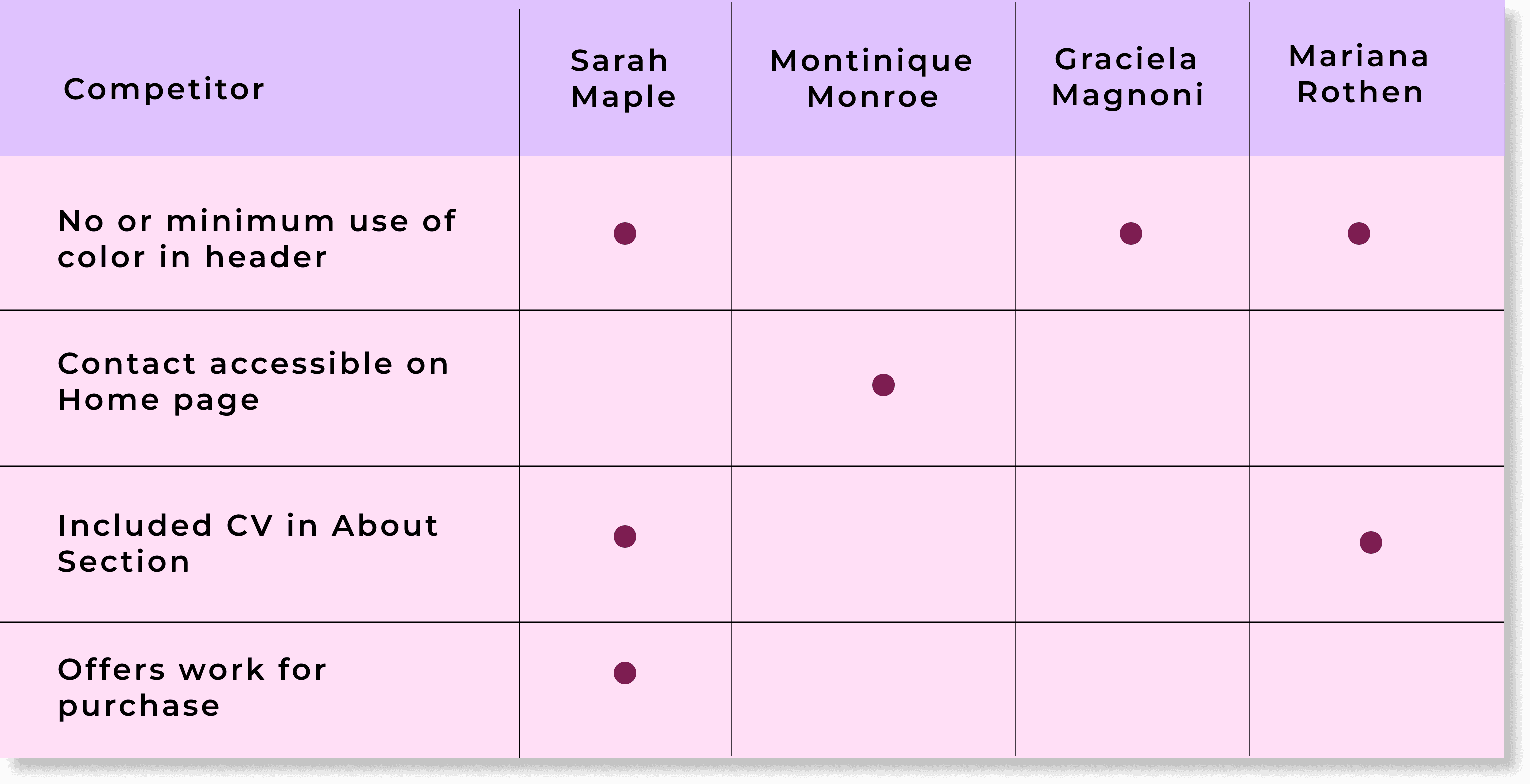
Competitors showcased significant experience, often including detailed biographies or full CVs on their About pages and/or links to press clippings.
One artist offered their work for sale through an online shop.
Collectively, they are established, prolific, and actively earning income from their photography.
Most of the sites were minimalist with limited use of color.
Only one out of the four artists featured contact information on both their Homepage and About page.
SWOT Analysis
SWOT Analysis
SWOT Analysis
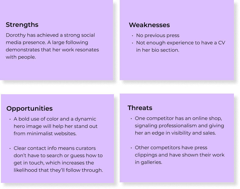
Next, I completed a SWOT analysis to help me find ways Dorothy could differentiate herself from other photographers in the market and position her work to catch the eye of museums and magazines.
Next, I completed a SWOT analysis to help me find ways Dorothy could differentiate herself from other photographers in the market and position her work to catch the eye of museums and magazines.
Next, I completed a SWOT analysis to help me find ways Dorothy could differentiate herself from other photographers in the market and position her work to catch the eye of museums and magazines.
Idea #1:
Idea #1:
Idea #1:
With a bold, intentional color palette, Dorothy’s site would stand out from more neutral or minimalist portfolios, making it more memorable.
With a bold, intentional color palette, Dorothy’s site would stand out from more neutral or minimalist portfolios, making it more memorable.
Idea #2:
Idea #2:
Idea #2:
Highlighting clear, accessible contact information on her site will make it easier for curators and collaborators to connect with her, giving her an edge on competitors.
Highlighting clear, accessible contact information on her site will make it easier for curators and collaborators to connect with her, giving her an edge on competitors.
Idea #3:
Idea #3:
Idea #3:
A striking hero image will immediately set her apart, clearly conveying her artistic style and message while helping to establish a strong visual identity.
A striking hero image will immediately set her apart, clearly conveying her artistic style and message while helping to establish a strong visual identity.
Ideation & Prototyping
Ideation & Prototyping
Ideation & Prototyping
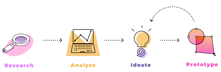
After completing my research and analysis on how to make Dorothy’s site stand out, I moved into the ideation phase—starting with paper and digital wireframes, conducting self-guided testing, and ultimately creating high-fidelity prototypes in Figma.
After completing my research and analysis on how to make Dorothy’s site stand out, I moved into the ideation phase—starting with paper and digital wireframes, conducting self-guided testing, and ultimately creating high-fidelity prototypes in Figma.
After completing my research and analysis on how to make Dorothy’s site stand out, I moved into the ideation phase—starting with paper and digital wireframes, conducting self-guided testing, and ultimately creating high-fidelity prototypes in Figma.
Digital Wireframe
Digital Wireframe
I created a digital wireframe based on Dorothy’s goals and priorities, designing a clear layout that laid the foundation for visual styling and user flow.
I created a digital wireframe based on Dorothy’s goals and priorities, designing a clear layout that laid the foundation for visual styling and user flow.
I created a digital wireframe based on Dorothy’s goals and priorities, designing a clear layout that laid the foundation for visual styling and user flow.
Navigation
Navigation
I opted for a clean, straightforward navigation featuring Dorothy’s name and logo at the top, along with a placeholder for a bold image to immediately capture the viewer’s attention.
Portfolio
Portfolio
This section showcases Dorothy’s photography. The layout was designed to be flexible, making it easy to add or remove images as her body of work evolves.
This section showcases Dorothy’s photography. The layout was designed to be flexible, a it easy to add or remove images as her body of work evolves.
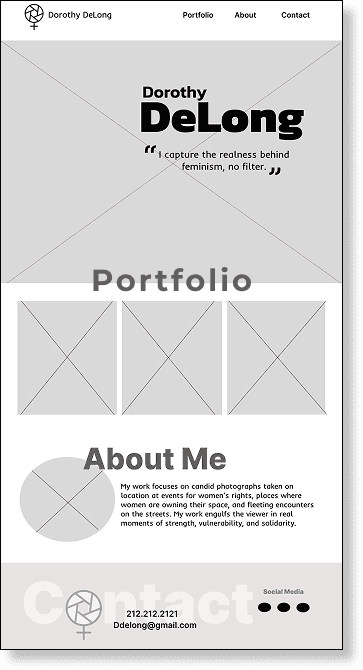

About
After introducing her work, it felt natural to follow with more context about the artist. This section includes her artist statement and a headshot to provide a personal connection.
Contact
The site ends with a footer featuring contact info and social links, making it easy for curators and editors to get in touch.
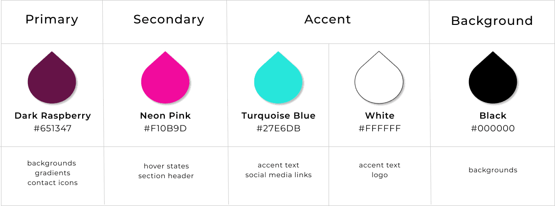
Color palette
Color palette
As I reviewed Dorothy’s images, I aimed to choose a color scheme that would complement their bold, vibrant tones without overshadowing her portfolio. The goal was to reflect a feminist vision through color—thoughtful and empowering, without relying on clichés.
As I reviewed Dorothy’s images, I aimed to choose a color scheme that would complement their bold, vibrant tones without overshadowing her portfolio. The goal was to reflect a feminist vision through color—thoughtful and empowering, without relying on clichés.
As I reviewed Dorothy’s images, I aimed to choose a color scheme that would complement their bold, vibrant tones without overshadowing her portfolio. The goal was to reflect a feminist vision through color—thoughtful and empowering, without relying on clichés.
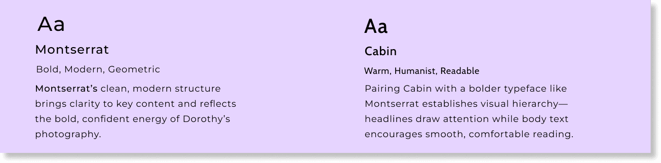
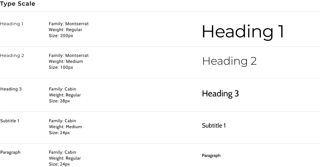
Typography
Typography
Results
Results
Results
With the structure in place, I moved the digital wireframe into a high-fidelity prototype to bring Dorothy’s website to life using Figma.
With the structure in place, I moved the digital wireframe into a high-fidelity prototype to bring Dorothy’s website to life using Figma.
With the structure in place, I moved the digital wireframe into a high-fidelity prototype to bring Dorothy’s website to life using Figma.
High-Fidelity Prototyping & Visual Design
High-Fidelity Prototyping & Visual Design
High-Fidelity Prototyping & Visual Design
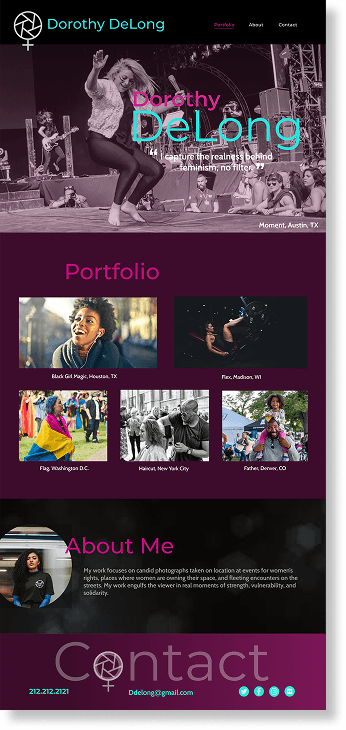
Hero Section Enhancements
Hero Section Enhancements
Hero Section Enhancements
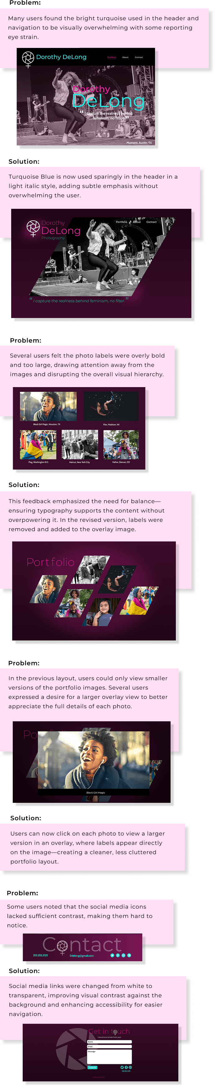
Inserted Dorothy’s personal quote in the header and increased the font size to create immediate impact and draw the user’s attention.
Applied a subtle raspberry gradient over the hero image to improve text legibility and tie in with the dominant background color.
Inserted Dorothy’s personal quote in the header and increased the font size to create immediate impact and draw the user’s attention.
Applied a subtle raspberry gradient over the hero image to improve text legibility and tie in with the dominant background color.
Typography & Color Integration
Typography & Color Integration
Typography & Color Integration
Introduced the selected typefaces and color palette to test their effectiveness within the layout.
Used teal and neon pink sparingly to maintain strong contrast and ensure the photography remained the focal point.
Implemented neon pink hover states to add interactivity and highlight navigation.
Introduced the selected typefaces and color palette to test their effectiveness within the layout.
Used teal and neon pink sparingly to maintain strong contrast and ensure the photography remained the focal point.
Implemented neon pink hover states to add interactivity and highlight navigation.
Contact Section Design
Contact Section Design
Contact Section Design
Designed the Contact section with enlarged, bold text to make it stand out and encourage visitor engagement.
Included clear contact icons and social media links styled in turquoise blue to draw the eye and prompt action.
Designed the Contact section with enlarged, bold text to make it stand out and encourage visitor engagement.
Included clear contact icons and social media links styled in turquoise blue to draw the eye and prompt action.
Listening to user Feedback
Listening to user Feedback
Listening to user Feedback
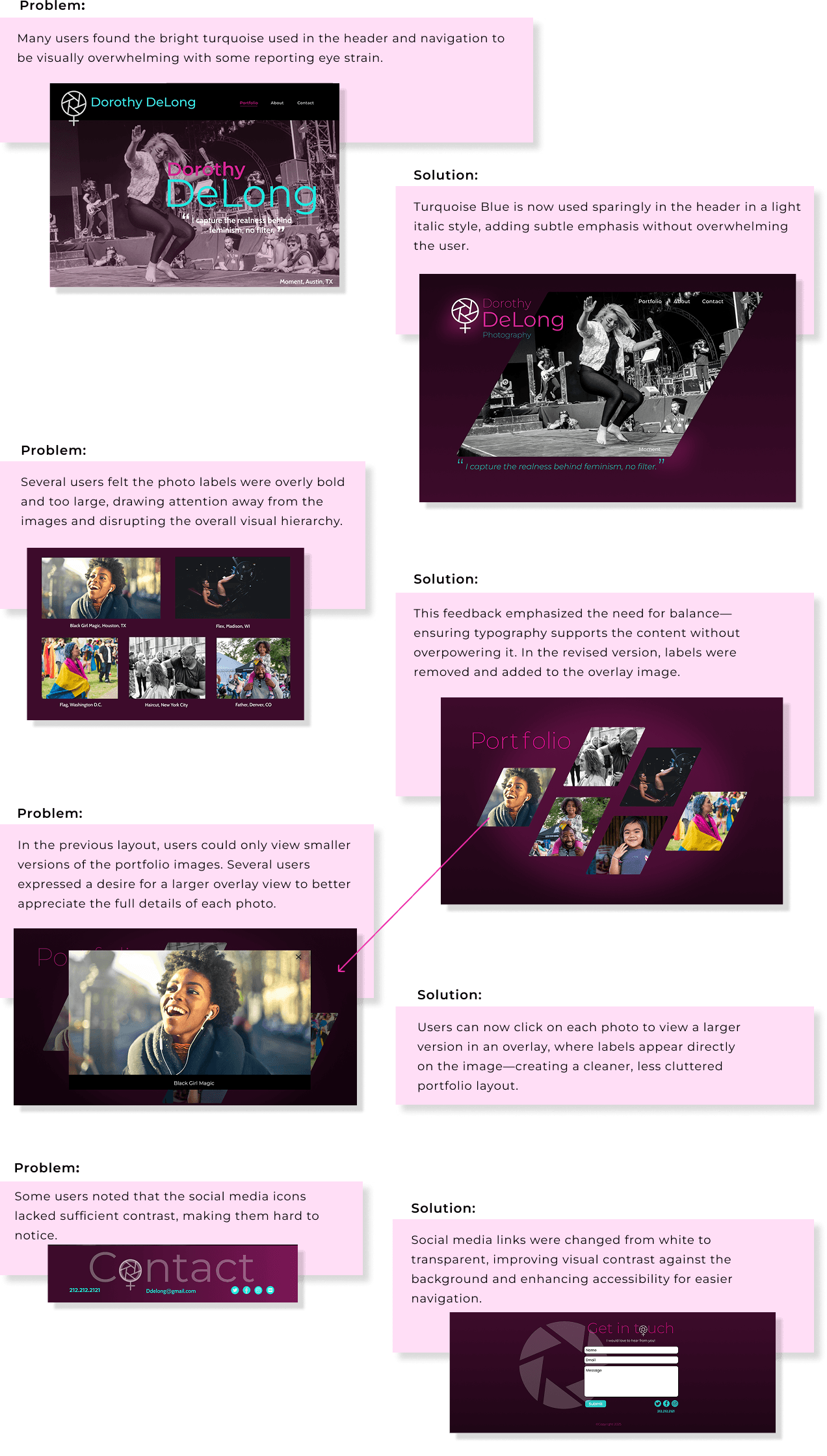
To evaluate the impact of the visual design, I ran a user test with 15 participants using Lyssna. In response to user feedback and updated input from Dorothy, I completed a new round of refinements to ensure the site aligned more closely with both user needs and her evolving goals.
To evaluate the impact of the visual design, I ran a user test with 15 participants using Lyssna. In response to user feedback and updated input from Dorothy, I completed a new round of refinements to ensure the site aligned more closely with both user needs and her evolving goals.
To evaluate the impact of the visual design, I ran a user test with 15 participants using Lyssna. In response to user feedback and updated input from Dorothy, I completed a new round of refinements to ensure the site aligned more closely with both user needs and her evolving goals.
Evolving the Experience
Evolving the Experience
Evolving the Experience
Dorothy and I explored ways to make her website stand out even further with a more engaging visual experience. I developed a more interesting visual style by cropping images into bold, angular frames and used Figma’s animation features to introduce subtle movement—enhancing the UX with a layout that feels both energetic and immersive. An online contact form was included in the Contact section to make it easy for visitors to reach out, encouraging more meaningful inquiries.
Dorothy and I explored ways to make her website stand out even further with a more engaging visual experience. I developed a more interesting visual style by cropping images into bold, angular frames and used Figma’s animation features to introduce subtle movement—enhancing the UX with a layout that feels both energetic and immersive. An online contact form was included in the Contact section to make it easy for visitors to reach out, encouraging more meaningful inquiries.
Dorothy and I explored ways to make her website stand out even further with a more engaging visual experience. I developed a more interesting visual style by cropping images into bold, angular frames and used Figma’s animation features to introduce subtle movement—enhancing the UX with a layout that feels both energetic and immersive. An online contact form was included in the Contact section to make it easy for visitors to reach out, encouraging more meaningful inquiries.
Watch the revised Dorothy DeLong website
Watch the revised Dorothy DeLong website

View Website Page
View Page


Lessons Learned
Lessons Learned
Lessons Learned
This project highlighted the importance of creating a distinct, professional presence for an emerging artist, helping her stand out in a space often dominated by more established names.
This project highlighted the importance of creating a distinct, professional presence for an emerging artist, helping her stand out in a space often dominated by more established names.
I designed this experience entirely from scratch—there was no existing website, branding, or structure to reference. This gave me the opportunity to lead the full creative process, from initial research and ideation to final visual design and prototyping.
I designed this experience entirely from scratch—there was no existing website, branding, or structure to reference. This gave me the opportunity to lead the full creative process, from initial research and ideation to final visual design and prototyping.
View More Case Studies
View More Case Studies
More Case Studies
City Cycles
Booking Process
Whole Bean Coffee
Branding & Identity


City Cycles
Booking Process
City Cycles
Booking Process
Whole Bean Coffee
Branding & Identity
Whole Bean Coffee
Branding & Identity
Let's connect
Let's connect
Let's connect
