BOOKING PLATFORM
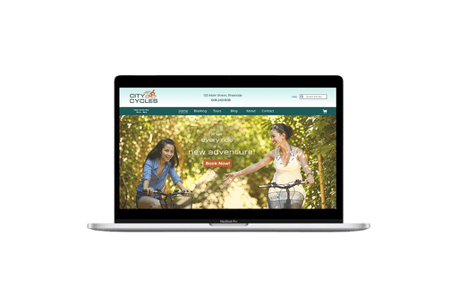
City Cycles
City Cycles
City Cycles
COMPANY
COMPANY
City Cycles
City Cycles
City Cycles
ROLE
ROLE
UX Designer
UX Designer
UX Designer
YEAR
YEAR
2024
2024
2024
Improving Online Reservations
Improving Online Reservations
Improving Online Reservations
City Cycles, a bike rental in downtown Riverside, wanted to improve their online reservation system to meet demand and reduce in-person visits and phone traffic.
City Cycles, a bike rental in downtown Riverside, wanted to improve their online reservation system to meet demand and reduce in-person visits and phone traffic.
City Cycles, a bike rental in downtown Riverside, wanted to improve their online reservation system to meet demand and reduce in-person visits and phone traffic.
Project Overview
Project Overview
Project Overview
City Cycles needed my help evaluating the user experience of their existing website, to uncover the causes of the decline in online reservations, and ensure that the online booking process is straightforward, smooth, and enjoyable for customers.
City Cycles needed my help evaluating the user experience of their existing website, to uncover the causes of the decline in online reservations, and ensure that the online booking process is straightforward, smooth, and enjoyable for customers.
City Cycles needed my help evaluating the user experience of their existing website, to uncover the causes of the decline in online reservations, and ensure that the online booking process is straightforward, smooth, and enjoyable for customers.
Design Process
Design Process
Design Process

My responsibilities
My responsibilities
My responsibilities
Conducting qualitative and quantitative research to understand City Cycles users and their pain points.
Brainstorming and defining solutions to address the users’ problems or frustrations.
Developing wireframes of potential solutions to visualize concepts.
Creating prototypes to illustrate suggested site updates.
Running user tests on these prototypes and refining the solutions based on feedback.
Presenting final recommendations and next steps to stakeholders for implementation.
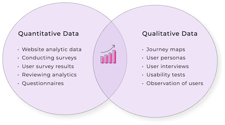
UX Research Process
UX Research Process
UX Research Process
Understanding the User's Perspective
Understanding the User's Perspective
For this project, I examined City Cycles' users and their challenges. I conducted interviews and surveys, analyzed data, and created a user persona and journey map to understand their pain points and needs.
For this project, I examined City Cycles' users and their challenges. I conducted interviews and surveys, analyzed data, and created a user persona and journey map to understand their pain points and needs.
For this project, I examined City Cycles' users and their challenges. I conducted interviews and surveys, analyzed data, and created a user persona and journey map to understand their pain points and needs.

Problem Statement:
Problem Statement:
Problem Statement:
"How might we get more customers to make bike reservations on the City Cycles website?"
"How might we get more customers to make bike reservations on the City Cycles website?"
"How might we get more customers to make bike reservations on the City Cycles website?"
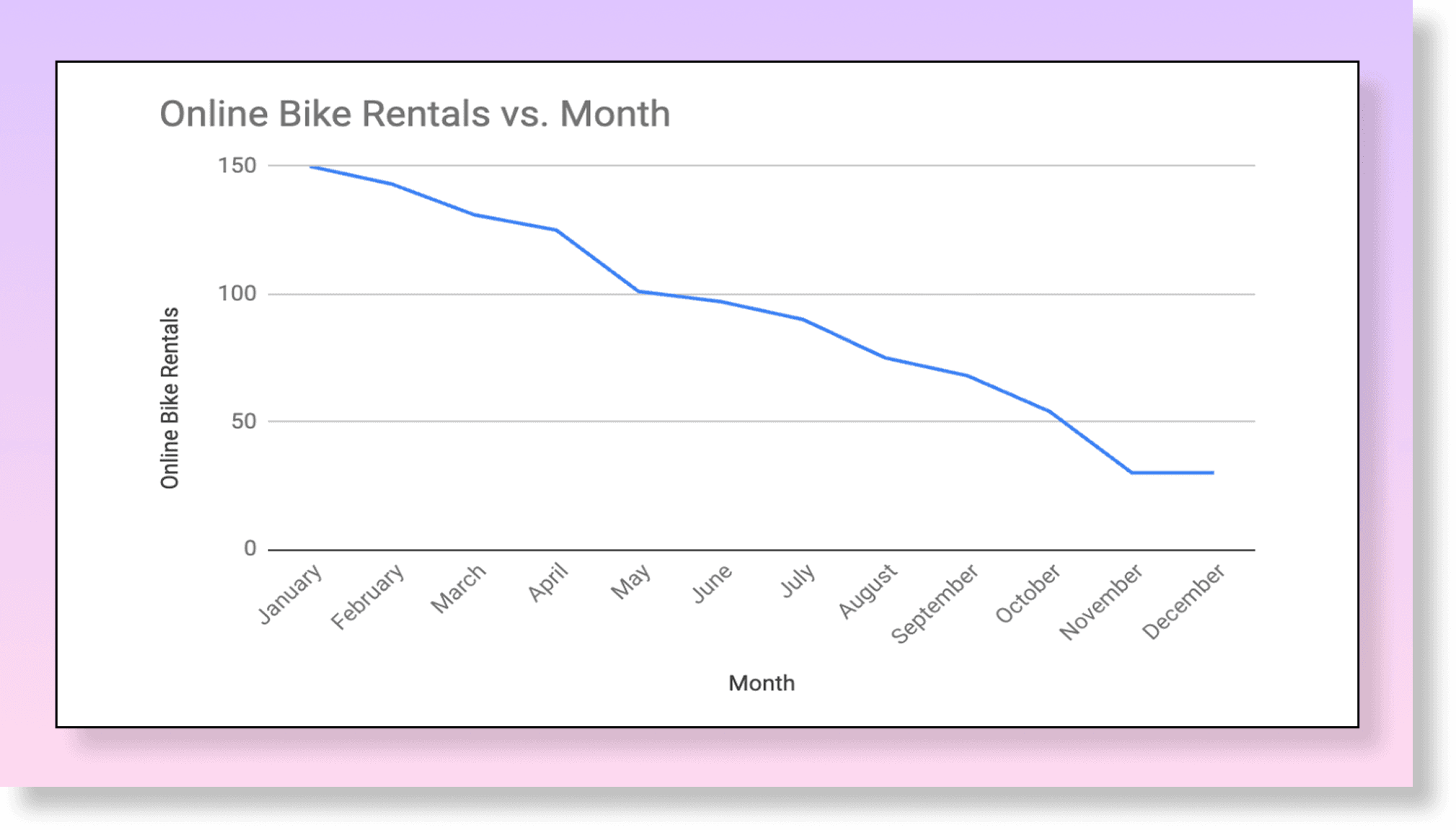
Data Analytics
Data Analytics
Data Analytics
Over the year, reservations steadily declined, and by December, online bike rentals dropped by 80% compared to January, indicating customers are avoiding the current system.
Over the year, reservations steadily declined, and by December, online bike rentals dropped by 80% compared to January, indicating customers are avoiding the current system.
Over the year, reservations steadily declined, and by December, online bike rentals dropped by 80% compared to January, indicating customers are avoiding the current system.
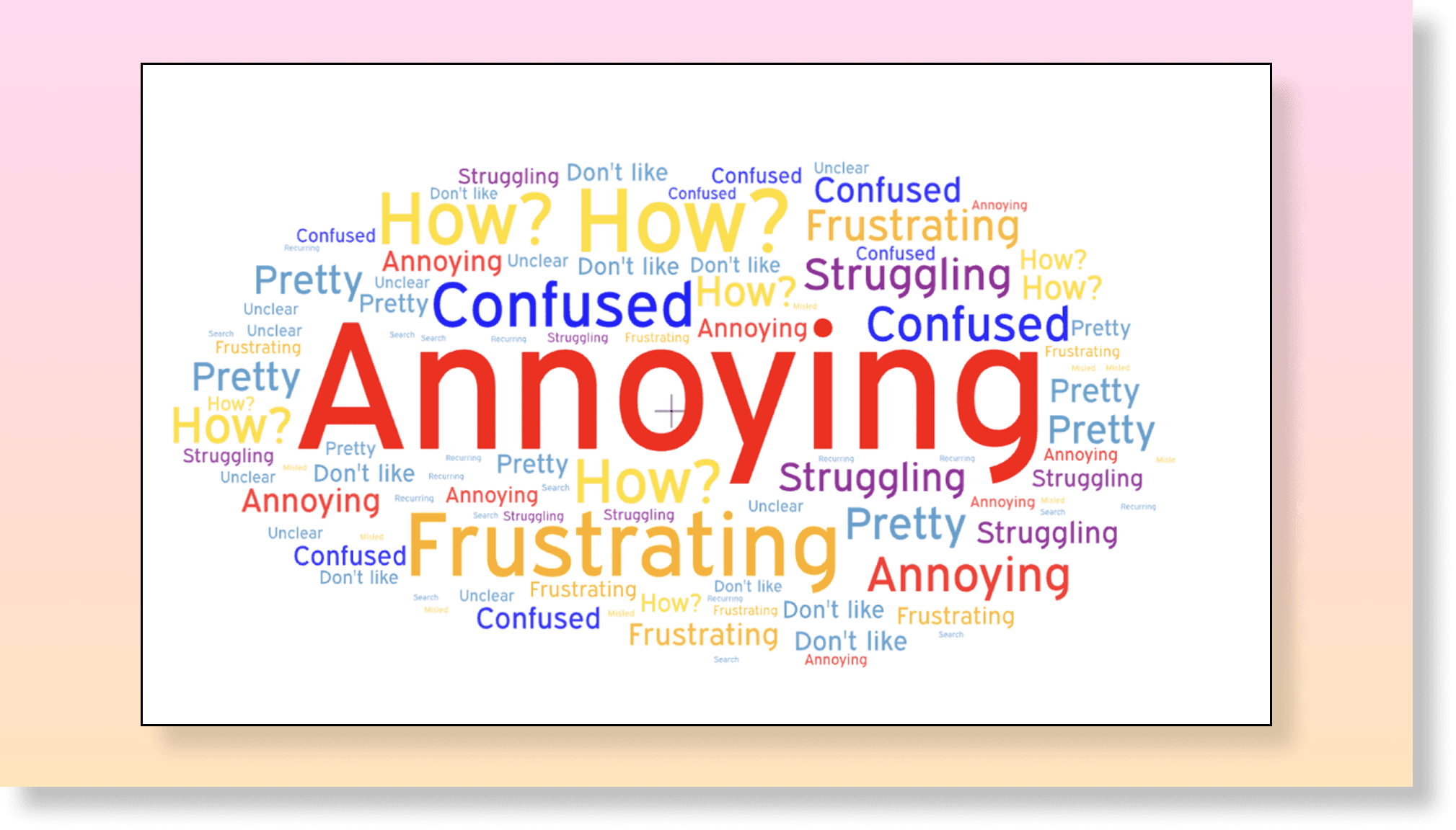
User Interviews
User Interviews
Customer frustration with the online system increased in-person reservations and overwhelmed phone lines, with many describing their experience as "frustrating" or "annoying."
Customer frustration with the online system increased in-person reservations and overwhelmed phone lines, with many describing their experience as "frustrating" or "annoying."
User Interviews
Customer frustration with the online system increased in-person reservations and overwhelmed phone lines, with many describing their experience as "frustrating" or "annoying."
The data analytics and user interviews revealed important areas where the City Cycles site could be improved:
The data analytics and user interviews revealed important areas where the City Cycles site could be improved:
The data analytics and user interviews revealed important areas where the City Cycles site could be improved:
Users struggled to find the reservation page, navigating through multiple confusing clicks. When they finally located it, their frustration increased, as it opened their default email app instead of a straightforward booking form.
The current system is unintuitive with repetitive information on each page.
User Persona
User Persona
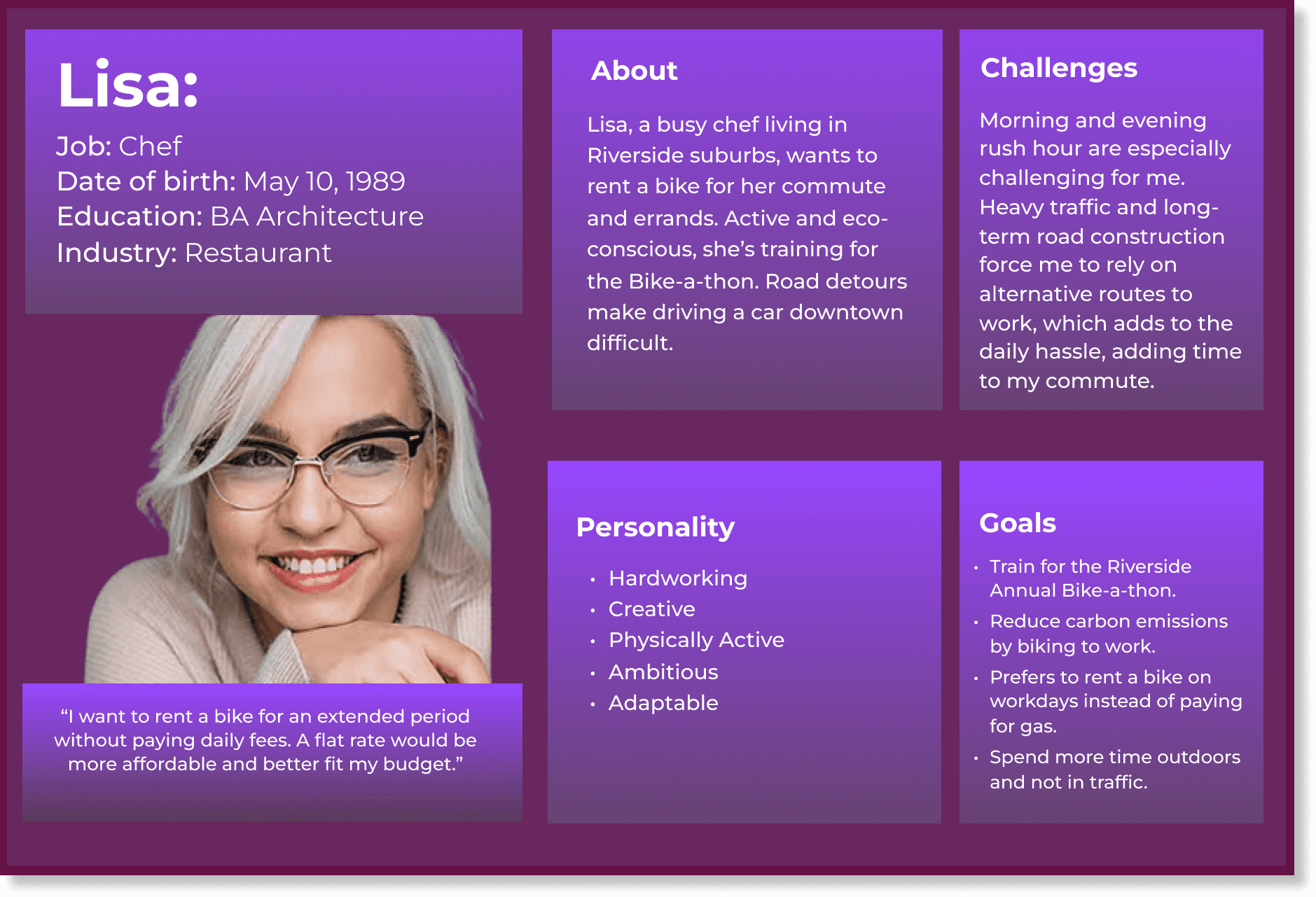
Some points that helped me empathize with the user:
Some points that helped me empathize with the user:
Some points that helped me empathize with the user:
The user wants to lower her carbon footprint by biking to work.
She prefers to rent a bike without returning it daily.
A discounted monthly rental would encourage more frequent use and allow her to train for the Riverside Annual Bike-a-thon.
The user wants to lower her carbon footprint by biking to work.
She prefers to rent a bike without returning it daily.
A discounted monthly rental would encourage more frequent use and allow her to train for the Riverside Annual Bike-a-thon.
The user wants to lower her carbon footprint by biking to work.
She prefers to rent a bike without returning it daily.
A discounted monthly rental would encourage more frequent use and allow her to train for the Riverside Annual Bike-a-thon.
Journey Map
Journey Map
Journey Map
User Persona
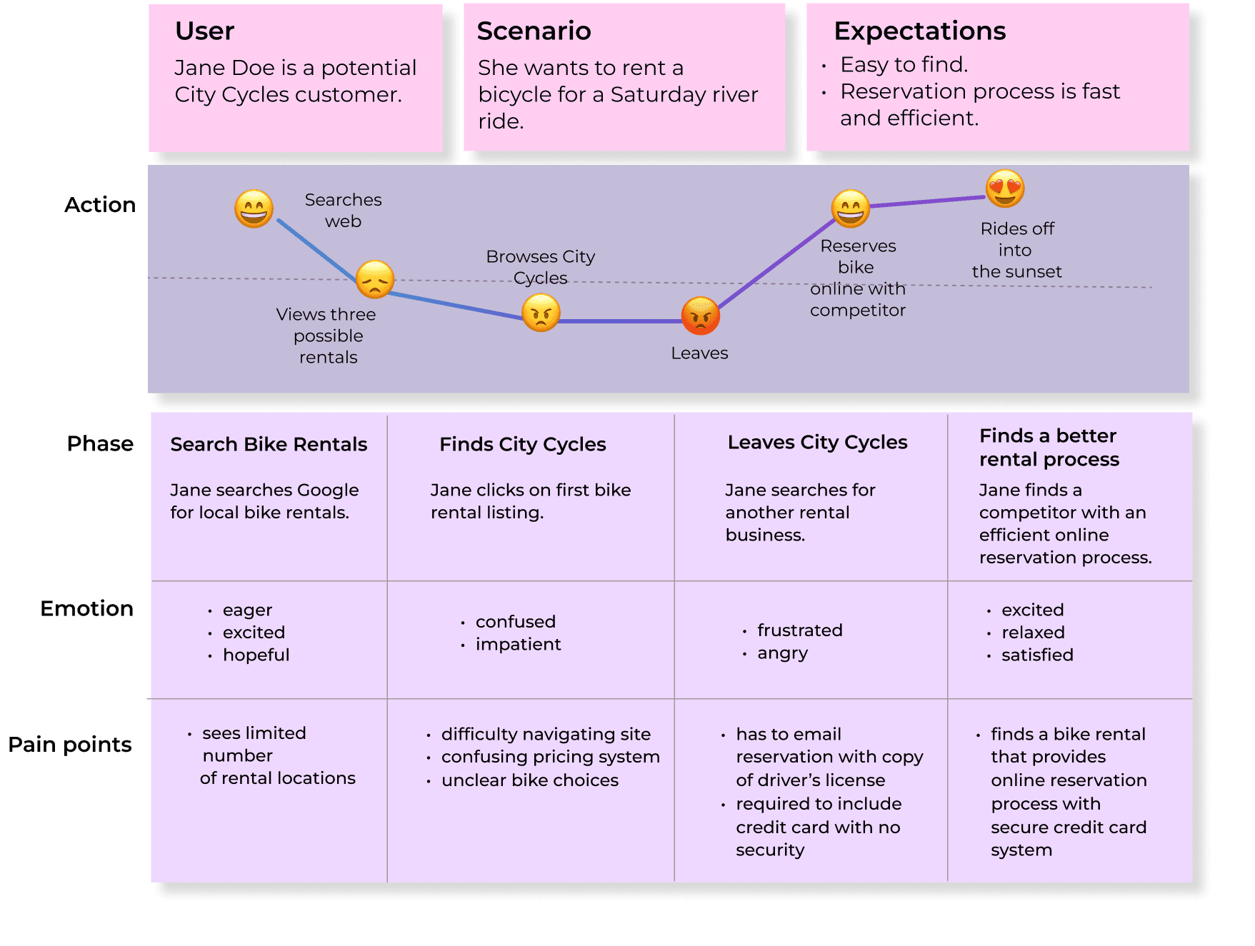
The journey map highlighted key areas where the City Cycles site could be improved to reduce user frustration:
The journey map highlighted key areas where the City Cycles site could be improved to reduce user frustration:
The journey map highlighted key areas where the City Cycles site could be improved to reduce user frustration:
Emailing the reservation with a copy of a driver’s license and credit card without security leaves customers vulnerable to fraud.
Confusing pricing and unclear bike options make the site hard to navigate, forcing customers to call for more information and increasing frustration.
Emailing the reservation with a copy of a driver’s license and credit card without security leaves customers vulnerable to fraud.
Confusing pricing and unclear bike options make the site hard to navigate, forcing customers to call for more information and increasing frustration.
Emailing the reservation with a copy of a driver’s license and credit card without security leaves customers vulnerable to fraud.
Confusing pricing and unclear bike options make the site hard to navigate, forcing customers to call for more information and increasing frustration.
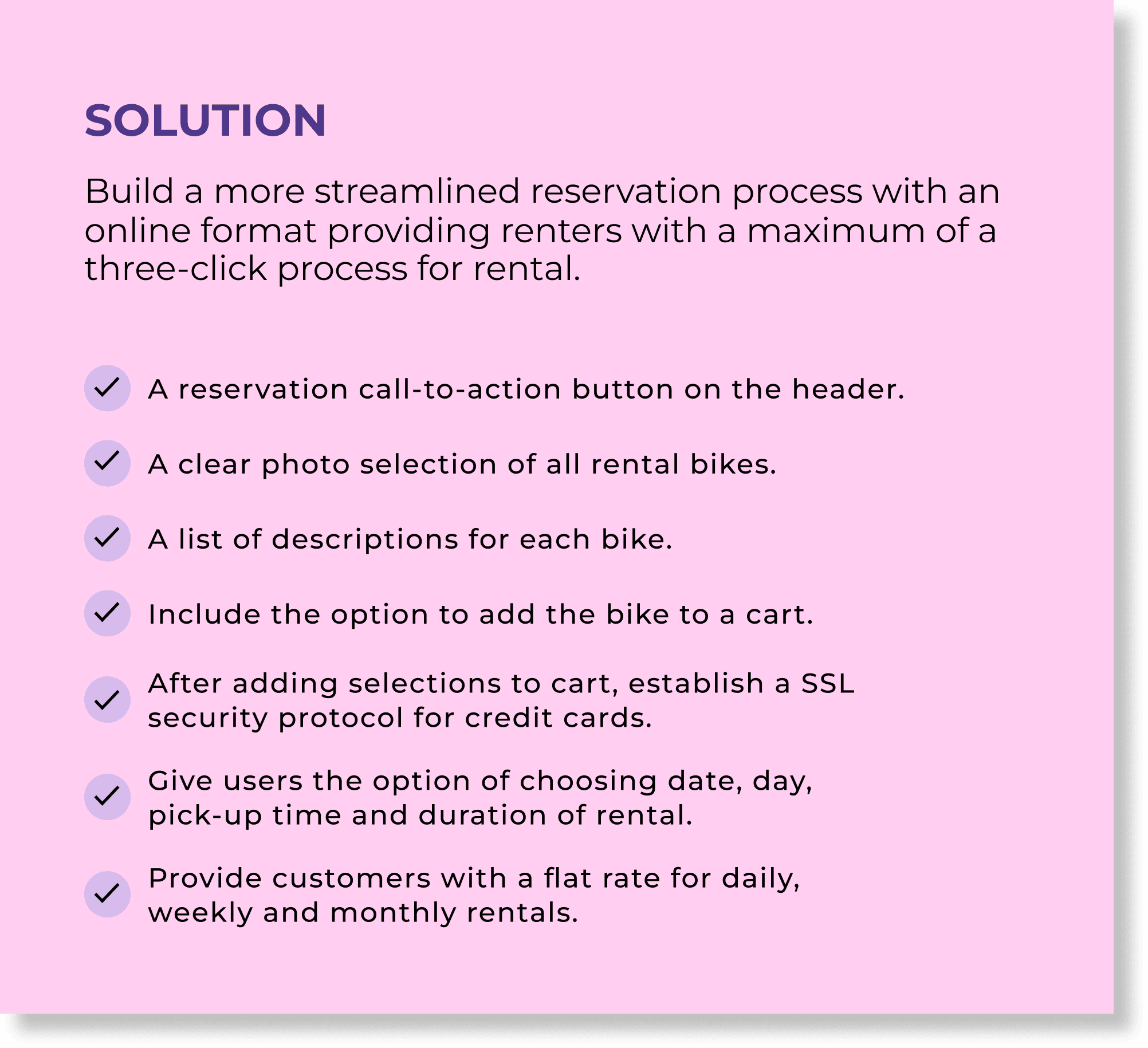
User-Centered Improvements
User-Centered Improvements
User-Centered Improvements
As a result of conducting this UX research and empathizing with my users, I converted challenges into solutions.
As a result of conducting this UX research and empathizing with my users, I converted challenges into solutions.
As a result of conducting this UX research and empathizing with my users, I converted challenges into solutions.
Ideation & Protototyping
Ideation & Protototyping
Ideation & Protototyping
After completing the research and defining key solutions, I entered the ideation phase—beginning with paper and digital wireframes, running self-guided tests, and eventually developing high-fidelity prototypes in Figma.
After completing the research and defining key solutions, I entered the ideation phase—beginning with paper and digital wireframes, running self-guided tests, and eventually developing high-fidelity prototypes in Figma.
After completing the research and defining key solutions, I entered the ideation phase—beginning with paper and digital wireframes, running self-guided tests, and eventually developing high-fidelity prototypes in Figma.
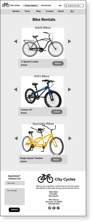
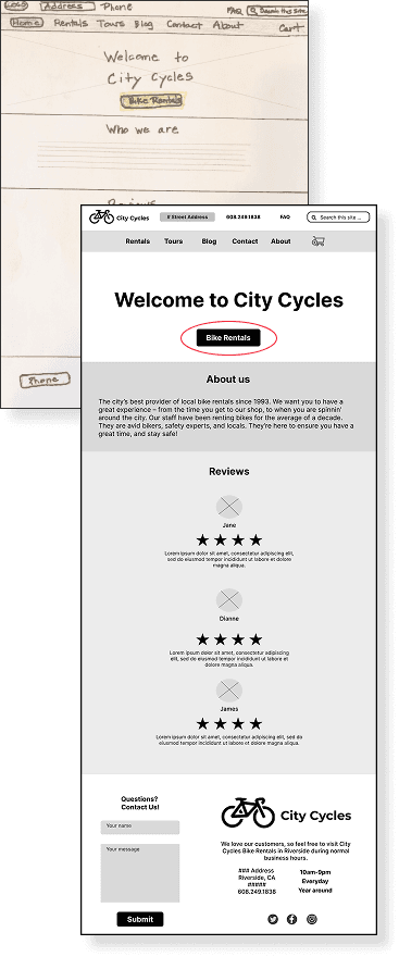
Paper Digital Wireframe
Paper Digital Wireframe
Paper Digital Wireframe
The initial concept:
The initial concept:
The initial concept:
A call-to-action button on the Home page header that links to a separate page featuring categorized bike selections displayed in a photo carousel.
A call-to-action button on the Home page header that links to a separate page featuring categorized bike selections displayed in a photo carousel.
A call-to-action button on the Home page header that links to a separate page featuring categorized bike selections displayed in a photo carousel.
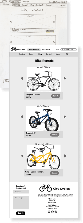
Problem:
Problem:
The buttons on the photo carousel were labeled "select," which could confuse users into thinking they only highlight the bike for viewing rather than adding it to the cart.
The buttons on the photo carousel were labeled "select," which could confuse users into thinking they only highlight the bike for viewing rather than adding it to the cart.
Solution:
Solution:
Changed the button label to “add to cart.”
Changed the button label to “add to cart.”
Problem:
Problem:
The wireframe ideations didn’t showcase the bike selections on the Home page, failing to showcase the products where users look first .
The wireframe ideations didn’t showcase the bike selections on the Home page, failing to showcase the products where users look first .
Solution:
Solution:
Moved bike selections to the Home page.
Moved bike selections to the Home page.
Self-guided test results
Through a quick self-guided test, I learned the following:
Through a quick self-guided test, I learned the following:
Self-guided test results
Self-guided test results
Through a quick self-guided test, I learned the following:
Through a quick self-guided test, I learned the following:
Problem:
Problem:
The buttons on the photo carousel were labeled "select," which could confuse users into thinking they only highlight the bike for viewing rather than adding it to the cart.
The buttons on the photo carousel were labeled "select," which could confuse users into thinking they only highlight the bike for viewing rather than adding it to the cart.
Solution:
Solution:
Changed the button label to “add to cart.”
Changed the button label to “add to cart.”
Problem:
Problem:
The wireframe ideations didn’t showcase the bike selections on the Home page, failing to showcase the products where users look first .
The wireframe ideations didn’t showcase the bike selections on the Home page, failing to showcase the products where users look first .
Solution:
Solution:
Moved bike selections to the Home page.
Moved bike selections to the Home page.
First Digital Prototype
First Digital Prototype
First Digital Prototype
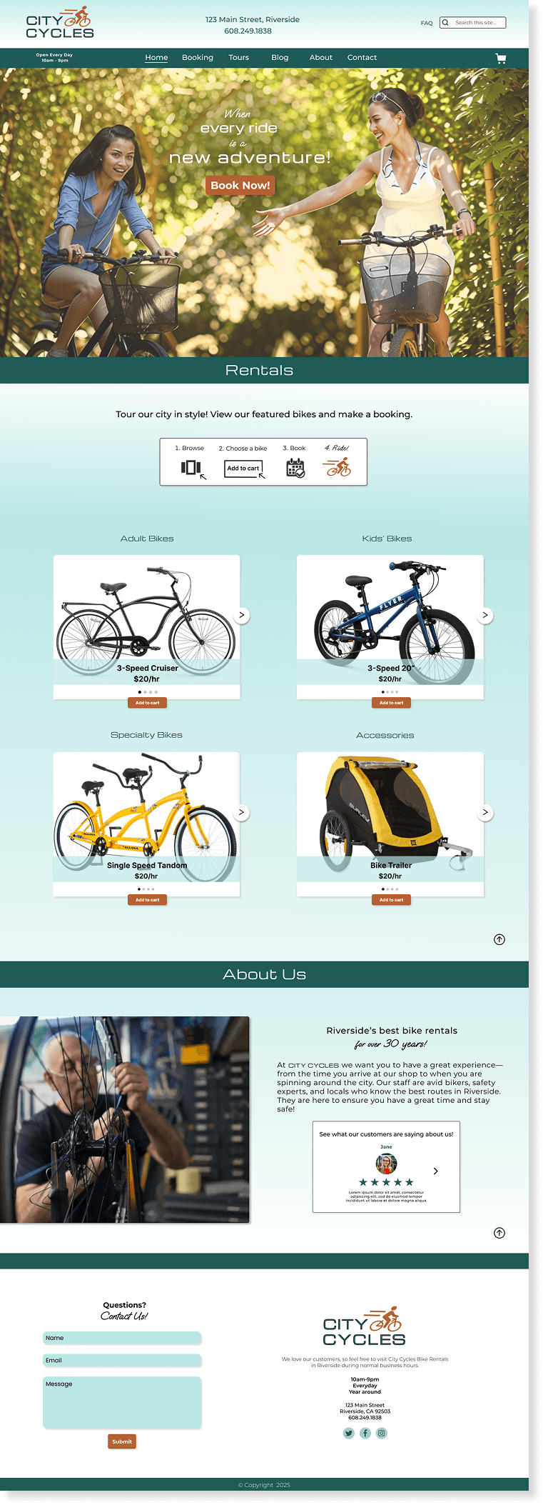
Revised home page features bike rentals directly below hero section.
Revised home page features bike rentals directly below hero section.
Revised home page features bike rentals directly below hero section.
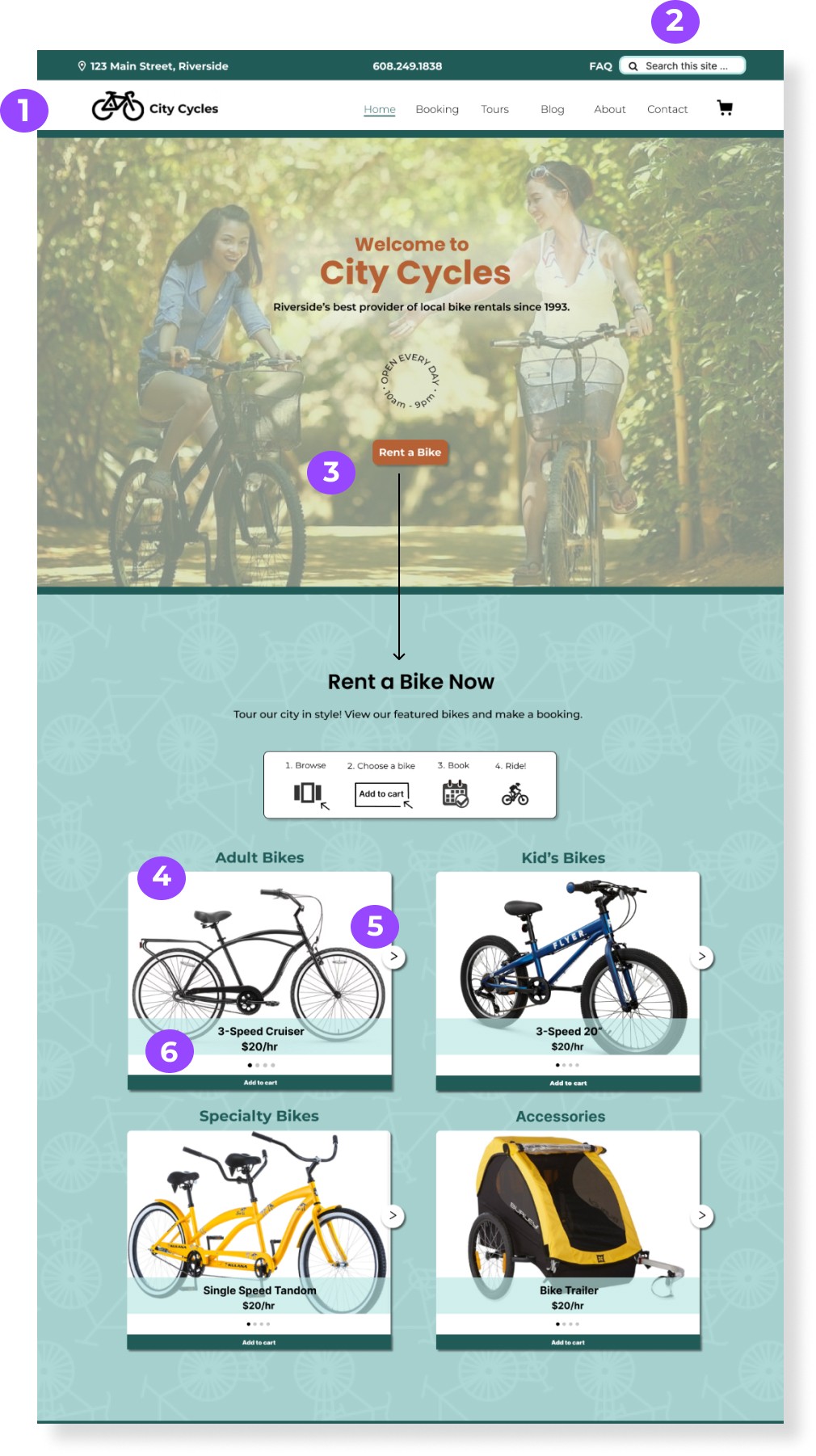
Double navigation bar
Double navigation bar
Double navigation bar
Streamlining navigation and reinforcing brand consistency to boost engagement for a more intuitive user experience.
Streamlining navigation and reinforcing brand consistency to boost engagement for a more intuitive user experience.
Streamlining navigation and reinforcing brand consistency to boost engagement for a more intuitive user experience.
Search bar
Search bar
Search bar
Enables quick content discovery, even without knowing the exact page, leading to faster navigation and increased engagement.
Enables quick content discovery, even without knowing the exact page, leading to faster navigation and increased engagement.
Enables quick content discovery, even without knowing the exact page, leading to faster navigation and increased engagement.
Call-to-action button
Call-to-action button
Call-to-action button
Grabs users' attention and encourages them to start the rental process immediately.
Grabs users' attention and encourages them to start the rental process immediately.
Grabs users' attention and encourages them to start the rental process immediately.
4-6. Photo carousel
4-6. Photo carousel
4-6. Photo carousel
Helps users quickly understand and locate related options. Labels and pricing allow for quick comparison of bike type and cost at a glance. "Add to Cart" button links to reservation page.
Helps users quickly understand and locate related options. Labels and pricing allow for quick comparison of bike type and cost at a glance. "Add to Cart" button links to reservation page.
Helps users quickly understand and locate related options. Labels and pricing allow for quick comparison of bike type and cost at a glance. "Add to Cart" button links to reservation page.
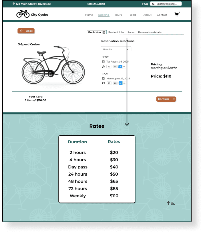
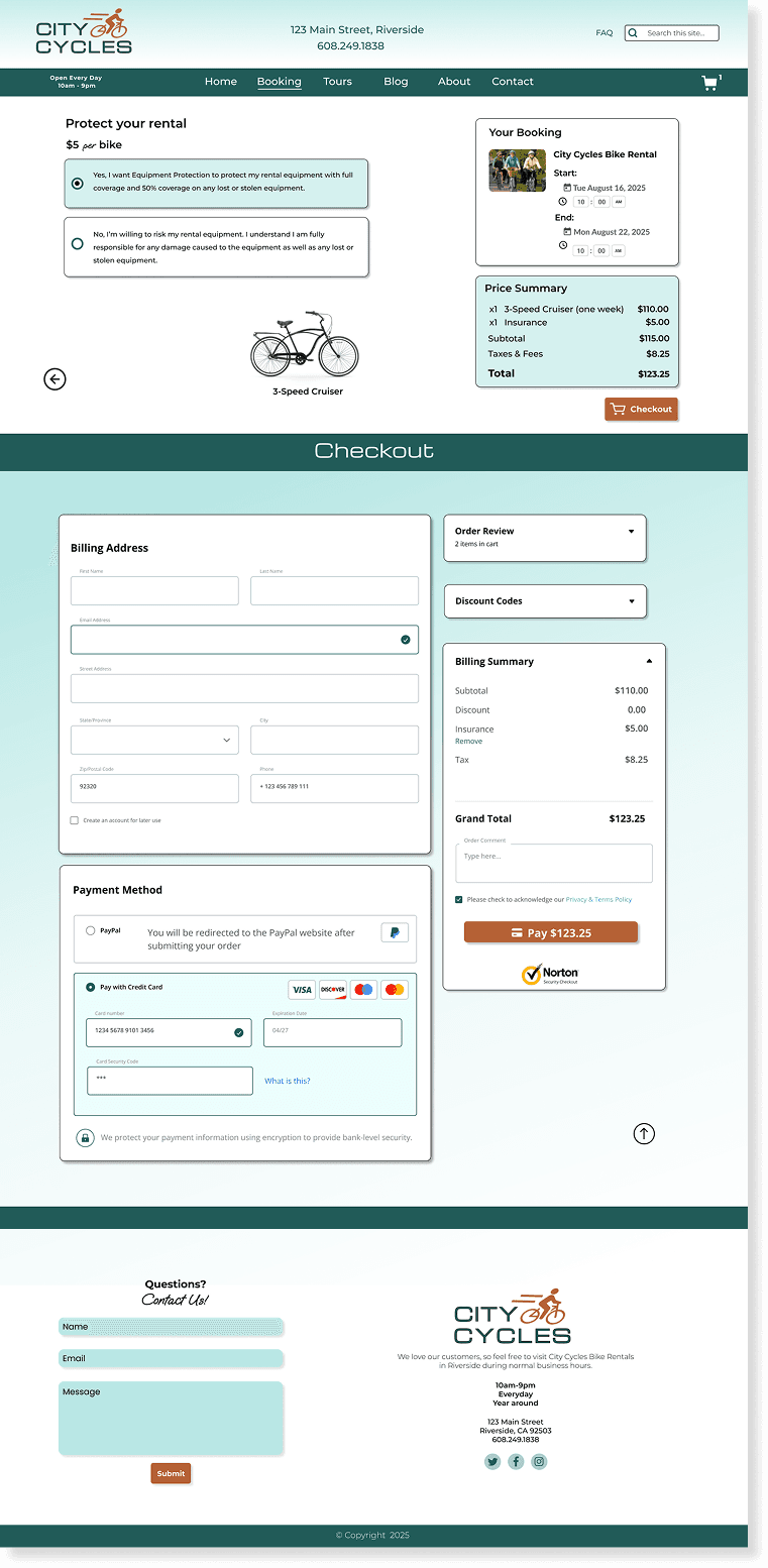
Reservation Page
Reservation Page
Reservation Page
Customizable booking options and rental details enable customers to quickly specify choices and access key information.
Customizable booking options and rental details enable customers to quickly specify choices and access key information.
Customizable booking options and rental details enable customers to quickly specify choices and access key information.
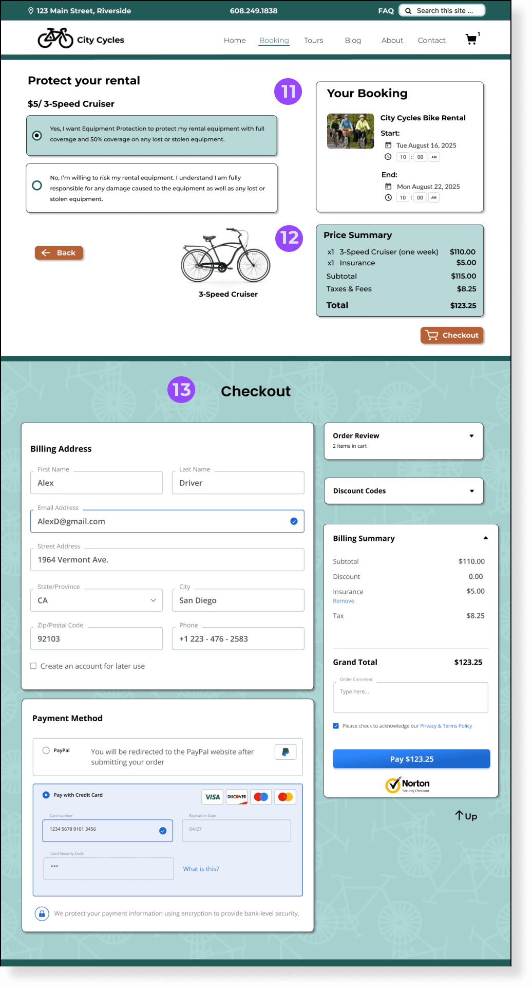
Booking Details
Booking Details
Allows users to view entire reservation details before checkout.
Allows users to view entire reservation details before checkout.
Price Summary
Price Summary
Lists all charges included with total charge for rental.
Lists all charges included with total charge for rental.
Secure Checkout
Secure Checkout
SSL security checkout prevents theft and fraud.
SSL security checkout prevents theft and fraud.
Quantity drop down
Quantity drop down
Quantity drop down
Allows users to choose how many rentals they need.
Allows users to choose how many rentals they need.
Allows users to choose how many rentals they need.
Calendar icon button
Calendar icon button
Calendar icon button
Enables quick content discovery, even without knowing the exact page, leading to faster navigation and increased engagement.
Enables quick content discovery, even without knowing the exact page, leading to faster navigation and increased engagement.
Enables quick content discovery, even without knowing the exact page, leading to faster navigation and increased engagement.
Time-changer
Time-changer
Time-changer
Allows customers to choose times of pick-up and drop-off.
Allows customers to choose times of pick-up and drop-off.
Allows customers to choose times of pick-up and drop-off.
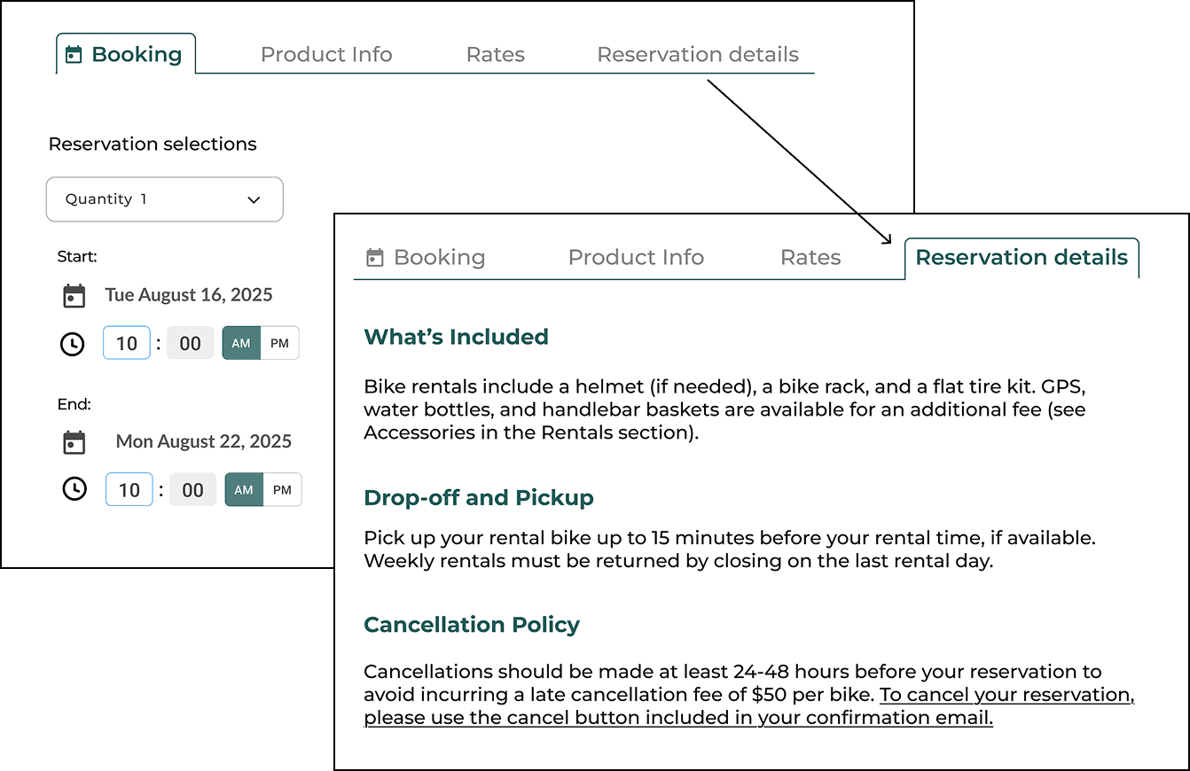
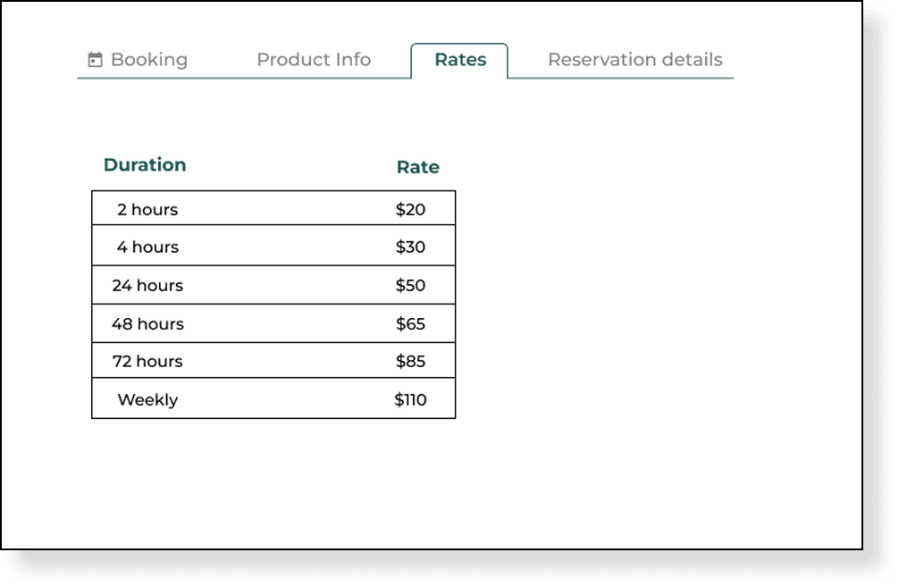
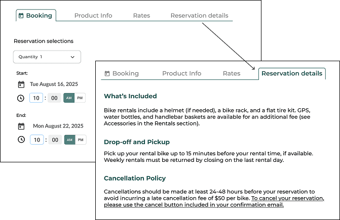
Product info, rates and reservation details tabs
Product info, rates and reservation details tabs
Product info, rates and reservation details tabs
Allows customers to view more bike specifications and detailed price breakdown.
Allows customers to view more bike specifications and detailed price breakdowns.
Allows customers to view more bike specifications and detailed price breakdown.

Checkout page
Checkout page
Checkout page
Booking details, price summary and secure checkout help to boost user confidence.
Booking details, price summary and secure checkout help to boost user confidence.
Booking details, price summary and secure checkout help to boost user confidence.
Booking Details
Allows users to view entire reservation details before checkout.
Price Summary
Lists all charges included with total charge for rental.
Secure Checkout
SSL security checkout prevents theft and fraud.
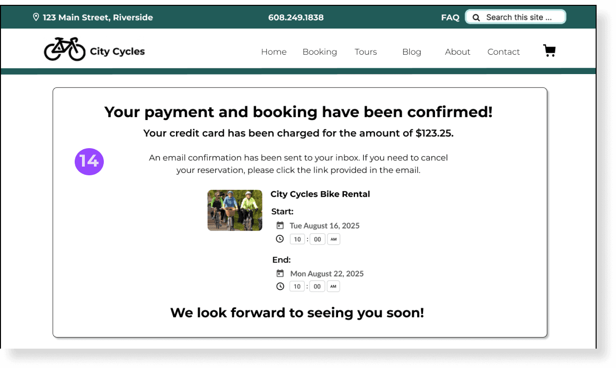
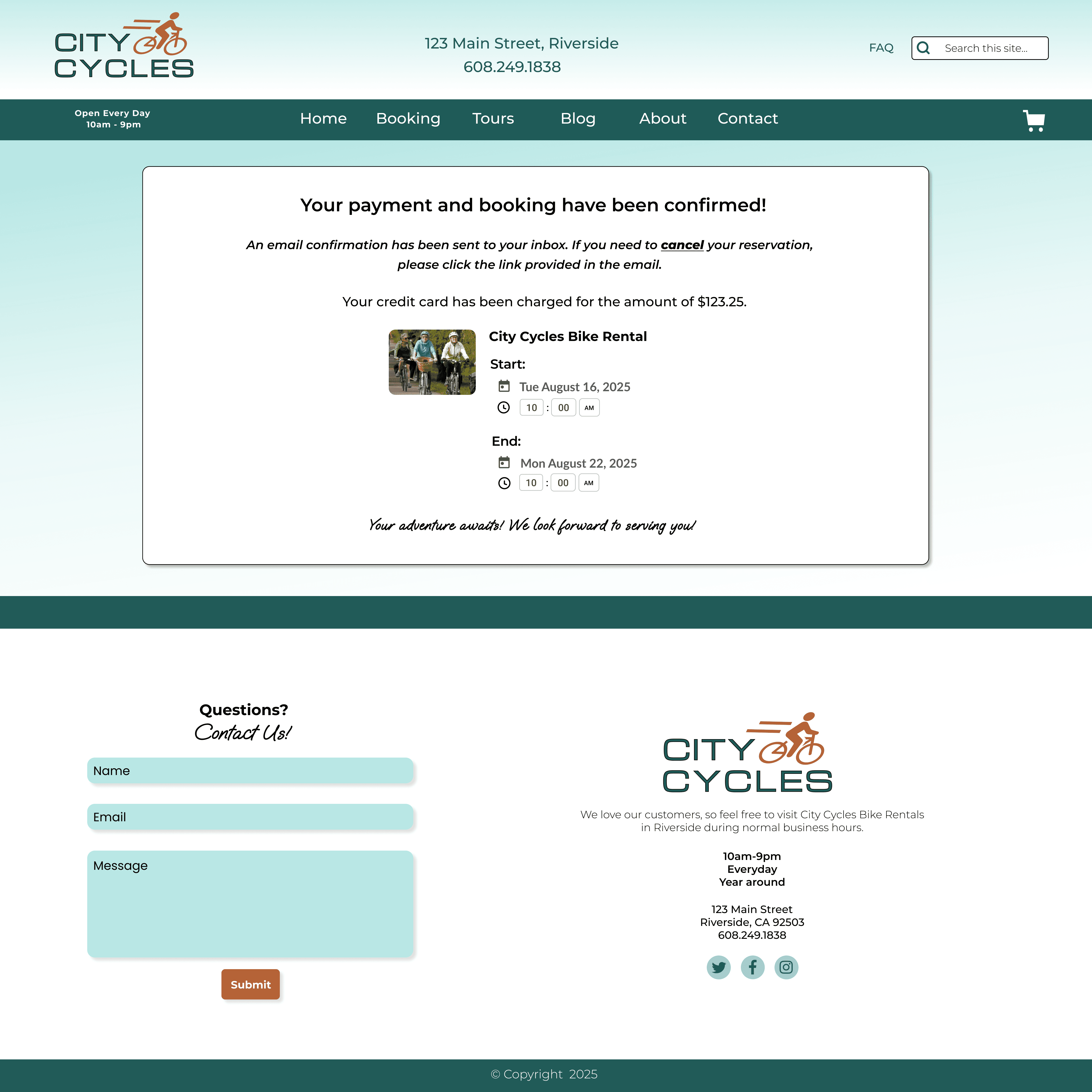
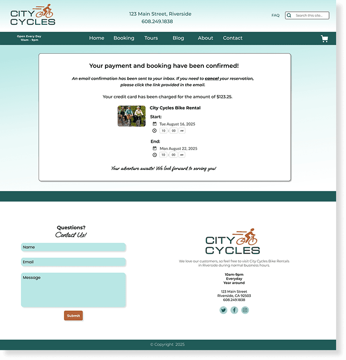
Confirmation page
Confirmation page
Confirmation page
Confirmation page provides all the information for their upcoming rental, assuring users that their booking process is complete.
Confirmation page provides all the information for their upcoming rental, assuring users that their booking process is complete.
Confirmation page provides all the information for their upcoming rental, assuring users that their booking process is complete.
Email Confirmation and Credit Card Charge.
Email Confirmation and Credit Card Charge.
Email Confirmation and Credit Card Charge.
Knowing their card will be charged and details sent via email builds trust and confidence in the process.
Knowing their card will be charged and details sent via email builds trust and confidence in the process.
Knowing their card will be charged and details sent via email builds trust and confidence in the process.
Listening to User Feedback
Listening to User Feedback
Listening to User Feedback
User testing helped me empathize with my users and make the following changes:
User testing helped me empathize with my users and make the following changes:
Problem:
Problem:
Problem:
Users were disappointed when clicking the Product Information, Reservation Details, and Rates links scrolled to different sections, instead of staying in the same area as expected.
Users were disappointed when clicking the Product Information, Reservation Details, and Rates links scrolled to different sections, instead of staying in the same area as expected.
Users were disappointed when clicking the Product Information, Reservation Details, and Rates links scrolled to different sections, instead of staying in the same area as expected.
Solution:
Solution:
Solution:
A tabbed interface links to overlay panels for each piece of information to meet user expectations.
A tabbed interface links to overlay panels for each piece of information to meet user expectations.
Users were disappointed when clicking the Product Info, Reservation Details, and Rates links scrolled to different sections, instead of staying in the same area as expected.
Problem:
Problem:
Problem:
Users disliked the layout of the rates summary, expressing that it was difficult to understand price comparison.
Users disliked the layout of the rates summary, expressing that it was difficult to understand price comparison.
Users were disappointed when clicking the Product Info, Reservation Details, and Rates links scrolled to different sections, instead of staying in the same area as expected.

Solution:
Solution:
Solution:
Rates are now displayed in a table format for easier comparison.
Rates are now displayed in a table format for easier comparison.
Users were disappointed when clicking the Product Info, Reservation Details, and Rates links scrolled to different sections, instead of staying in the same area as expected.
Problem:
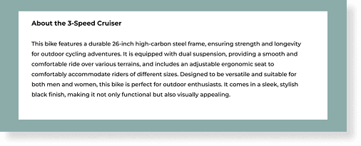
Users complained that the Product info was too long to read.
Solution:
Product information is organized into bullet points for clarity.
Problem:
Problem:
Users complained that the Product info was too long to read.
Users complained that the Product info was too long to read.

Solution:
Solution:
Product information is organized into bullet points for clarity.

“In the second round of testing, users felt confident using the booking page and easily found prices, product info, and reservation details.”
“In the second round of testing, users felt confident using the booking page and easily found prices, product info, and reservation details.”
“In the second round of testing, users felt confident using the booking page and easily found prices, product info, and reservation details.”
Next Steps
Next Steps
Next Steps
After two rounds of testing, I designed the final version, guided by feedback from participants.
After two rounds of testing, I designed the final version, guided by feedback from participants.
Final City Cycles prototype
Final City Cycles prototype
Final City Cycles prototype
Watch Booking Process
Watch Booking Process

View Website Pages
View Website Pages


Lessons Learned
Lessons Learned
Lessons Learned
The project emphasized the importance of clearly defining the scope upfront and using it as a guide for developing solutions.
Research and testing revealed many promising ideas to improve the City Cycles website, highlighting numerous areas in need of updates. However, most of these would require significant time to implement or didn't directly contribute to the primary goal of enhancing the reservation process.
Staying focused on the primary goal—increasing online bookings—was essential.
Using the “Now, Wow, How” framework with stakeholders, we identified practical solutions aligned with our core objective: to enhance reservation process and navigation for City Cycles.
View More Case Studies
More Case Studies
View More Case Studies

Dorothy DeLong
Photographer's Portfolio
Dorothy DeLong
Photographer's Portfolio
Whole Bean Coffee
Branding & Identity
Whole Bean Coffee
Branding & Identity